Introduction
The checkbox type field, part of the Settings API, renders one or more checkbox type inputs.
Example
The following example shows a section with a checkbox field. The ‘default_value’ property is set to ‘1’ for a choice, meaning the box will be checked by default. Once a user saves or submits their selections, the default no longer applies.
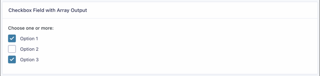
You may also include other HTML attributes as properties. In this example, the ‘data_format’ parameter stores selected choices as an array under the field name instead of as individual boolean values. This is useful when treating a checkbox group as a single array of selected items.
array(
    'title'  => 'Checkbox Field with Array Output',
    'fields' => array(
        array(
            'type'        => 'checkbox',
            'name'        => 'my_checkbox_array',
            'label'       => esc_html__( 'Choose one or more:', 'sometextdomain' ),
            'data_format' => 'array', // default is `bool`
            'choices'     => array(
                array(
                    'name'  => 'option_1',
                    'label' => esc_html__( 'Option 1', 'sometextdomain' ),
                ),
                array(
                    'name'  => 'option_2',
                    'label' => esc_html__( 'Option 2', 'sometextdomain' ),
                ),
                array(
                    'name'  => 'option_3',
                    'label' => esc_html__( 'Option 3', 'sometextdomain' ),
                ),
            ),
        ),
    ),
)
The selected choices are grouped in an array under the field name:
Array(
    [my_checkbox_array] => Array(
        [0] => option_1,
        [1] => option_3,
    )
)
The code above will render the checkbox field similar to the following: