Introduction
Gravity Forms themes (introduced in version 2.7) provide a new, easy way to change the look and feel of your forms from within the WordPress block editor.
Our introductory default theme, Orbital, presents a simple but stylish base for your forms. Once you select Orbital within the general Gravity Forms settings (to apply the theme globally across all forms) or within the Gravity Forms block settings or the Gravity Forms shortcode (to apply the theme only to individual forms), you’ll be able to configure and modify the appearance options from within the block editor.
Don’t want to change the look of your existing forms?
Nothing is applied by default, and no changes to existing forms will be made. As of Gravity Forms 2.7.15, new installations will apply the Orbital theme globally to all forms. Form themes for existing installations will need to be manually applied by setting a default form theme or specifically enabling a theme by modifying the setting on the Gravity Forms block or shortcode for that form.
Selecting a Theme
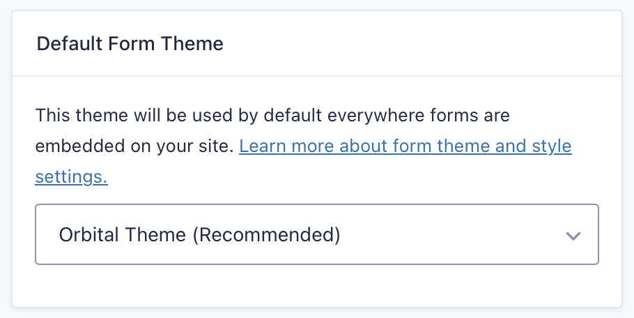
To select a global form theme to be applied to all forms, visit Forms → Settings in your WordPress site dashboard. Scroll past your license details and look for the Default Form Theme setting. The Gravity Forms 2.5 theme will be set as the default for sites that had Gravity Forms installed prior to the release of version 2.7.15. For new installations, the Orbital theme will be the default.
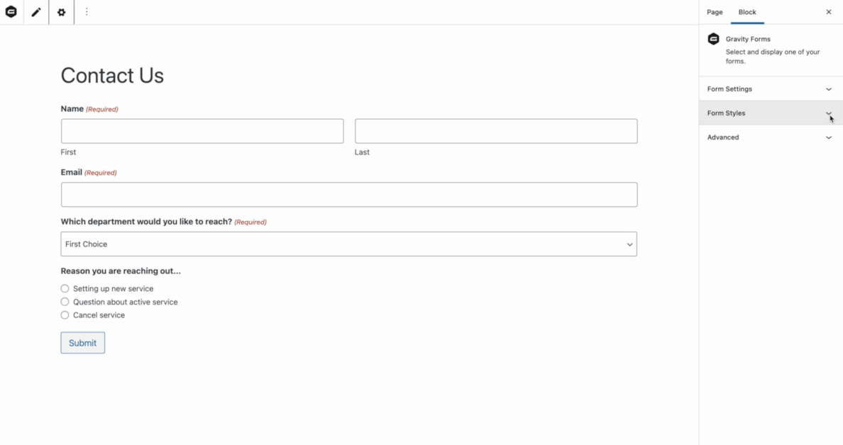
Block Settings
After adding a Gravity Forms Form block to your page, view the Block settings in the right sidebar of the WordPress page editor.
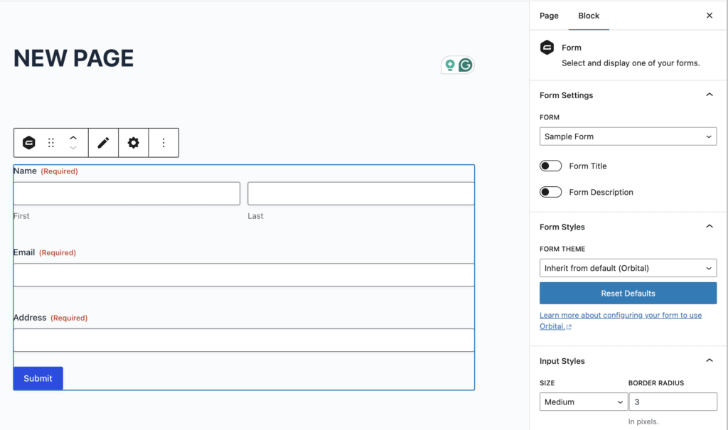
You have the option to output the Form Title and Form Description here.
Theme Settings
On the right side of the editor screen, click to open Form Styles and look for Form Theme. The Orbital theme includes a small number of common settings accessed via the block editor, with more on the way. Orbital inherits fonts from your theme, but you can use the options outlined below to change a number of other typography-related settings.
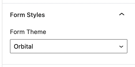
Form Styles
The Form Styles panel contains the Form Theme select as described above.
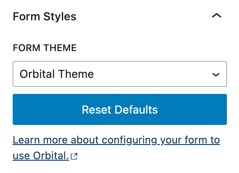
The Reset Defaults button shown above can be used to reset any style changes you’ve made back to the default colors, typography styles, etc. for the Orbital theme. You can then readjust any settings as needed to achieve the style you prefer.
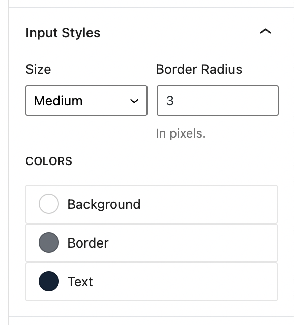
Input Styles
The Input Styles panel allows you to change the size, border radius, background color, border color, and text color for form inputs.
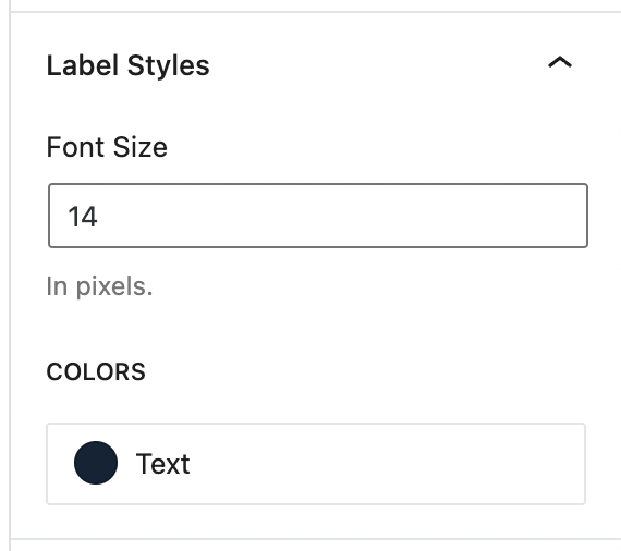
Label Styles
The Label Styles panel allows you to change the font size and text color for form labels.
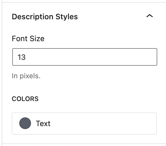
Description Styles
The Description Styles panel allows you to change the font size and text color of form descriptions.
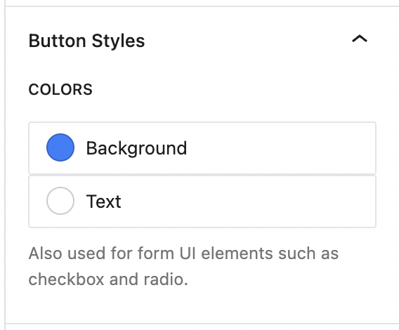
Button Styles
The Button Styles panel allows you to change the background color and text color for form buttons.
Live Preview
The Gravity Forms block provides a live preview of your form inside the editor screen. To enable the live preview, click on the Gravity Forms block, then open the Advanced section and toggle Preview to the ON position.
If your theme or other plugins include custom styles for Gravity Forms, the live preview may not be an exact match for what you see on your pages.
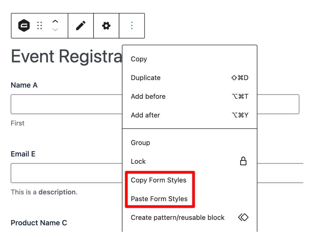
Copy/Paste Styles
The styles that have been configured for a specific Gravity Forms block can be applied to other Gravity Forms form blocks. To do so, access the block’s action menu via its toolbar and select Copy Form Styles. This will copy a JSON string representation of the form theme styles that have been set for that form. This will look something like the following…
{"theme":"orbital","inputSize":"md","inputBorderRadius":"5","inputBorderColor":"#686e77","inputBackgroundColor":"#fafafa","inputColor":"#112337","inputPrimaryColor":"#c14142","labelFontSize":"16","labelColor":"#112337","descriptionFontSize":"12","descriptionColor":"#a2a2a2","buttonPrimaryBackgroundColor":"#4c3b74","buttonPrimaryColor":"#fff"}
With that string on your clipboard, you can then focus on a different form block and select from the same menu, Paste Form Styles. After doing so, you can save the post/page in which the block has been embedded. This will automatically apply those styles to the focused form block.
This JSON string can also be used when setting styles via the shortcode parameter styles or when filtering styles via the filter gform_default_styles.