Note: With the release of Gravity Forms 4.0, support for legacy markup will be fully removed. This change marks the end of the original markup structure introduced in 2009 and finalizes the platform’s transition to modern form rendering. Although modern markup has been available since version 2.5, many forms still rely on legacy markup features, including Ready Classes, for layout control. Refer to the CSS Ready Classes Migration guide for more information.
Introduction
In Gravity Forms 1.5 we added “Ready Classes”. Using these new classes, you can easily create more advanced alternative layouts for the fields in your forms. Essentially, Ready Classes are class names that you can add to the parent element surrounding each field to take advantage of pre-defined styles included in the default form stylesheet.
How to Use Ready Classes
To add a Ready Class to a field, go to the Form Editor and select the field you want to change. Under the “Appearance” tab in the Settings Sidebar, you will see an input called “Custom CSS Class”.
Add the Ready Class name or names you want to add to the field here and then save the form.
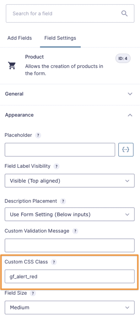
Note that Ready Classes feature do NOT show in the Form Editor display. Save the form and you can review the classes being applied in the Preview screen.
The Ready Class Names
Here are the Ready Classes that are built in the Gravity Forms default stylesheet that you can use right away without having to write any of your own CSS.
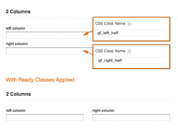
Halves (2 Columns)
Note: These only work with the “top label” form layout option and are intended to be used in left half/right half pairings to work properly.
- gf_left_half
This places the field in the left column (left half) of a 2 column layout. This only works with the “top label” form layout option.
- gf_right_half
This places the field in the left column (right half) of a 2 column layout. This only works with the “top label” form layout option.
To align two fields side by side (2 equal columns) you can add these classes. The two fields have to be adjacent to each other in the Form Builder. The gf_left_half class has to be added to the first field and the gf_right_half class to the second field.
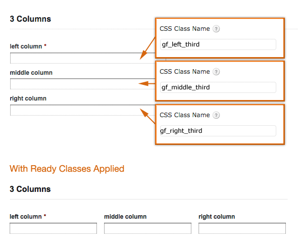
Thirds (3 Columns)
Note: These only work with the “top label” form layout option and are intended to be used in left third/middle third/right third pairings to work properly.
- gf_left_third
This places the field in the left column (left third) of a 3 column layout. This only works with the “top label” form layout option. - gf_middle_third
This places the field in the middle column (middle third) of a 3 column layout. This only works with the “top label” form layout option. - gf_right_third
This places the field in the right column (right third) of a 3 column layout. This only works with the “top label” form layout option.
To align three fields side by side (3 equal columns) you can add these classes. The three fields have to be adjacent to each other in the Form Builder. The gf_left_third class has to be added to the first field, the gf_middle_third class to the second field and the gf_right_third class to the third field.
Quarters (4 Columns)
Note: These only work with the “top label” form layout option and are intended to be used in left third/middle third/right third pairings to work properly.
- gf_first_quarter
This places the field in the first quarter of 4 column layout. This only works with the “top label” form layout option. - gf_second_quarter
This places the field in the second quarter of 4 column layout. This only works with the “top label” form layout option. - gf_third_quarter
This places the field in the third quarter of 4 column layout. This only works with the “top label” form layout option. - gf_fourth_quarter
This places the field in the fourth quarter of 4 column layout. This only works with the “top label” form layout option.
To align four fields side by side (4 equal columns) you can add these classes. The four fields have to be adjacent to each other in the Form Builder. The gf_first_quarter class has to be added to the first field, the gf_second_quarter class to the second field, the gf_third_quarter class to the third field, and the gf_fourth_quarter to the fourth field.
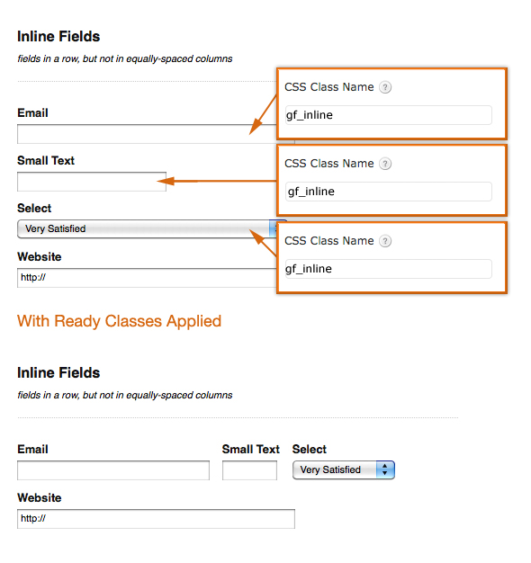
Inline (Fluid One Line)
- gf_inline
This places the field inline horizontally with other fields but does not create equally-spaced column layouts. This is useful for different sized fields or when you simply want a horizontal layout without actual column spacing.
List Classes
List Columns
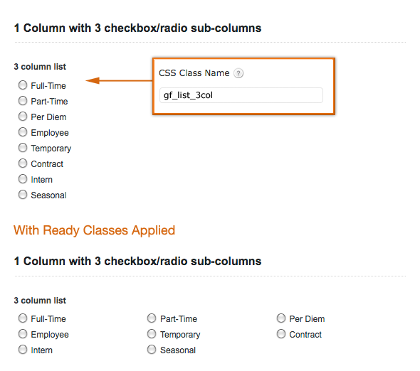
These ready classes turn a multiple choice/checkbox list into an equally-spaced column format with the defined number of columns and orientation. This only applies to multiple choice/checkbox lists and work with any of the form label position settings.
The first group will fill a list from left to right for the correct number of columns, then descending in rows until the list is exahusted.
- gf_list_2col
- gf_list_3col
- gf_list_4col
- gf_list_5col
The _vertical tagged classes will fill from top to bottom, left column first, splitting the list where needed to get the specified number of columns, with each column having as close to a similar number of entries as possible.
- gf_list_2col_vertical
- gf_list_3col_vertical
- gf_list_4col_vertical
- gf_list_5col_vertical
Inline Classes
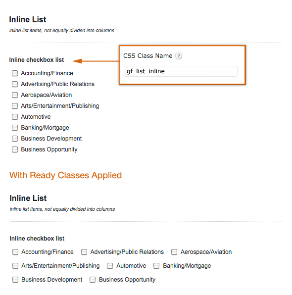
- gf_list_inline
This turns a multiple choice/checkbox list into an inline horizontal list (not evenly spaced columns). This only applies to multiple choice/checkbox lists and work with any of the form label position settings. See this article for an example using radio buttons.
List Height Classes
This applies a height value to all multiple choice/checkbox items in that list. This can be useful to avoid “hanging floats” caused by list items of unequal height. This only applies to multiple choice/checkbox lists and work with any of the form label position settings.
- gf_list_height_25
- gf_list_height_50
- gf_list_height_75
- gf_list_height_100
- gf_list_height_125
- gf_list_height_150
Horizontal Form Layout
This class is deprecated by the submit button being built directly into the Form Editor in Gravity Forms 2.6.
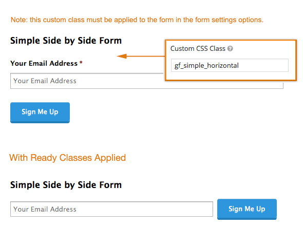
- gf_simple_horizontal
Note: This only works with the “top label” form layout option. When added to “CSS Class Name” in your form settings will create a very simple horizontal form layout (think simple email address field and inline form button). The field label is hidden so using the placeholder option for the field is recommended. Please note that this is intended for very simple, single input form types. Also, it works best if you set the input size to “large” in the field settings.
HTML Classes
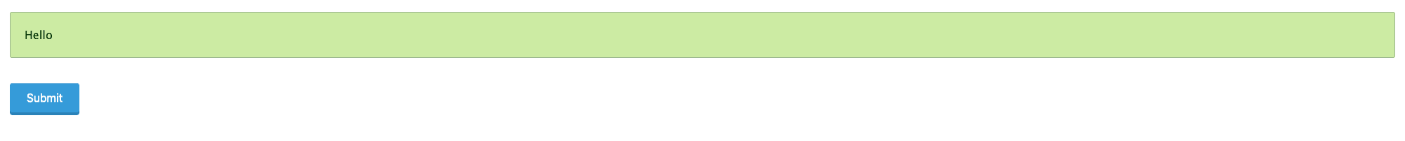
- gf_alert_green
This turns an HTML field and its contents into a green banner message. - gf_alert_red
This turns an HTML field and its contents into a red banner message. - gf_alert_yellow
This turns an HTML field and its contents into a yellow banner message. - gf_alert_gray
This turns an HTML field and its contents into a gray banner message. - gf_alert_blue
This turns an HTML field and its contents into a blue banner message.
Confirmation Classes
These classes can be added to the “CSS Class Name” input on an individual form’s settings page and will turn the confirmation message into a banner of the associated color. Note: this will only work with confirmation messages of the “text” type and not page or redirect confirmations.
- gf_confirmation_simple_yellow
This turns the confirmation message into a banner with a yellow background. - gf_confirmation_simple_gray
This turns the confirmation message into a banner with a gray background. - gf_confirmation_yellow_gradient
This turns the confirmation message into a banner with a yellow gradient background. - gf_confirmation_green_gradient
This turns the confirmation message into a banner with a green gradient background.

Other Classes
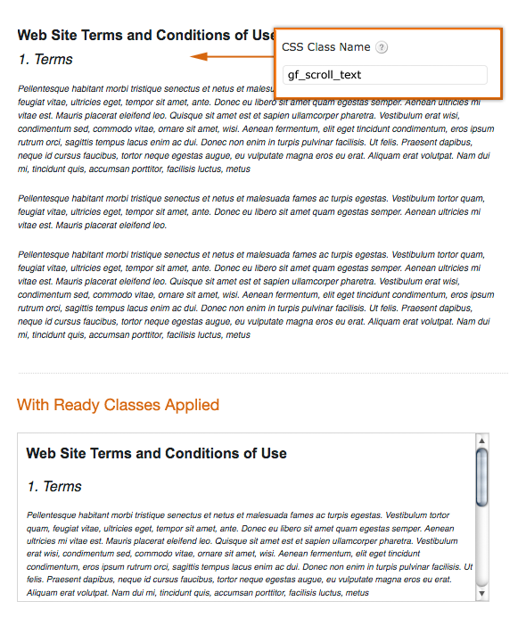
- gf_scroll_text
This converts a section break field into a box with a fixed height that will automatically show a scroll bar if there’s a large amount of text. This is useful if you’re wanting to show large amounts of content to the user, but don’t want to have to link to it or make the form very long to show it (Terms of Service Agreements, etc). This class only works on section breaks and works with any of the form label position settings.
- gf_hide_ampm
This hides the am/pm selector in the time field- this only hides the field on the form, not in the form entry table. This works with any of the form label position settings. - gf_hide_charleft
This hides the characters left counter beneath paragraph text fields when using the maximum characters option. This works with any of the form label position settings. - gf_invisible
This hides a field, useful for field types where the Visibility setting is not available, like product fields.
Q & A
- Can I use multiple classes on the same field?
Yes, you can use multiple classes together. Just separate each class name by a space. Note: This doesn’t work for all of the styles, but many can be combined if they’re applicable to the field type. For example, you may have a 2 column primary layout, and want to use 2 column list layouts within the columns.
- Can I create my own classes?
Yes, the classes are added to the parent <li> element surrounding a field so you can define your own class name and add your own rules to your theme stylesheet based on that class name being added to the field.
Additional Notes
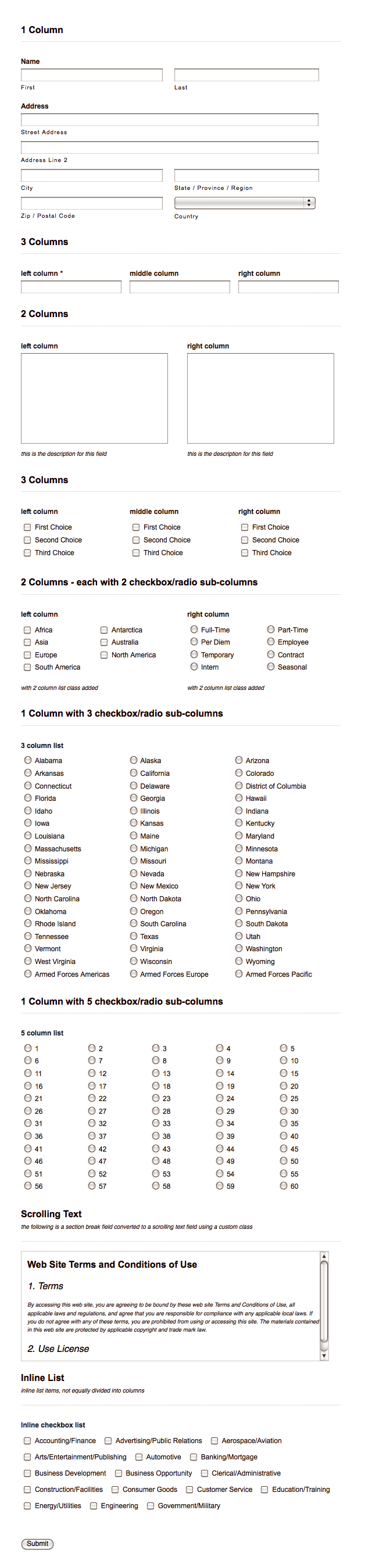
You can also see an example of several of these classes applied in one form here.
One final note. As with any CSS rules, your particular theme CSS may override or supersede some of these styles. They’ve been tested in a variety of themes and work well, but you may have to make some adjustments to your theme styles for everything to work properly.