

Introduction
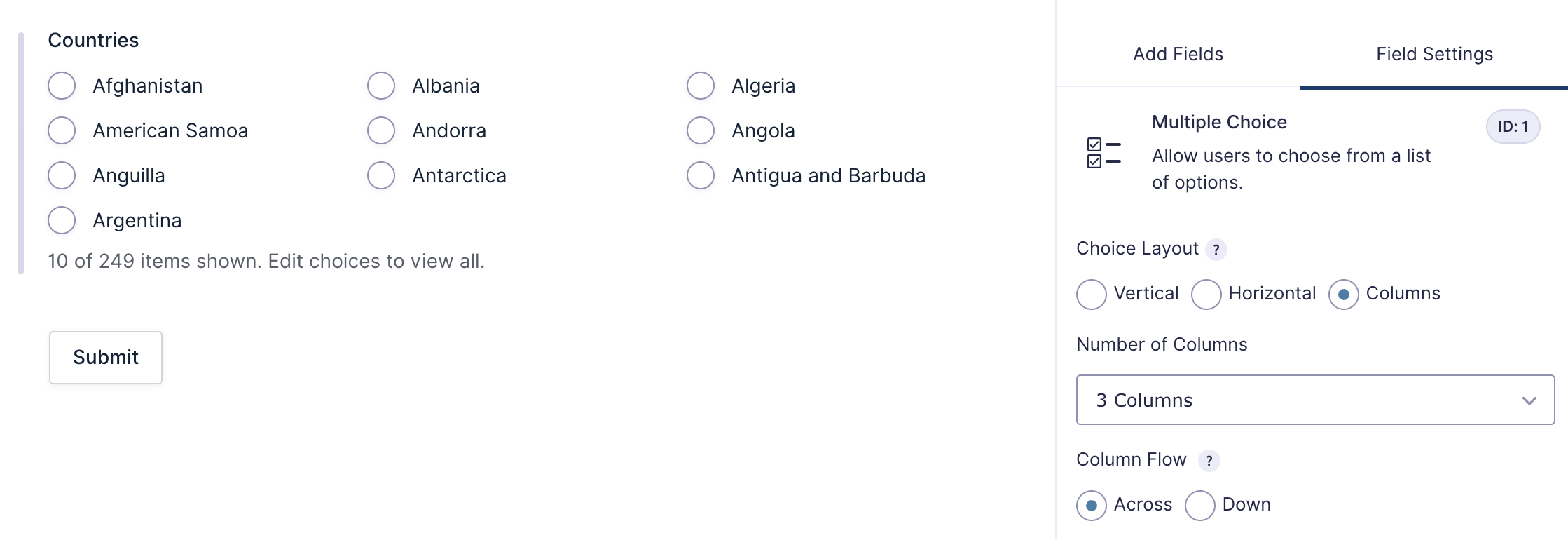
The Columns setting provides a built-in option in the Form Editor to arrange field choices into columns. You can select the number of columns and choose whether choices are displayed across (left to right) or down (top to bottom). This article explains how to use the new setting.
Note: Previously, arranging Checkbox and Radio Buttons field choices into columns required the use of Ready Classes. With the release of Gravity Forms 4.0, support for legacy markup and CSS Ready Classes will be entirely removed.
Locate the Setting
After adding a Checkbox, Multiple Choice, or Radio Button field:
- Open Field Settings.
- Go to the General tab.
- In the Choice Layout, choose Columns.
- Select the desired column configuration (number of columns and column flow).
Settings Reference
| Setting | Description |
|---|---|
| Number of columns | Select how many columns (1–5) the field choices should be arranged into. Defaults to 1 |
| Column Flow | Column Sort Direction determines how choices are ordered when displayed in multiple columns: – Across fills left to right, then moves to the next row – Down fills top to bottom, then moves to the next column. |
Note: Because CSS determines how content is distributed across columns, the number of displayed columns may not always match the configured setting. For example, selecting four columns with 5 or 9 items may result in only three columns being shown, as CSS avoids creating unevenly filled columns. This is a known CSS limitation and not an issue specific to Gravity Forms.