Summary
When editing a form, many fields offer the same group of settings. This article helps explain the most common ones. If the setting you are interested in is not listed here, refer to the more specific user guide documentation for the Field Type you are using.
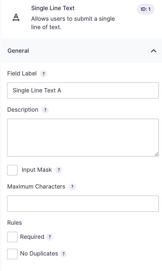
General Settings Section
| Setting | Description |
|---|---|
| Field Label | The name by which this field is displayed. It appears on the front-end (when users fill out your embedded form) and within admin interfaces where the field must be selected (e.g., conditional logic, merge tags, Entries list). |
| Description | An extended text area for annotating the field’s purpose or providing instructions. If filled out, it will display beneath the field on the form. |
| Input Mask | Available for Single Line Text fields and Post Custom fields only. When enabled, admins can choose or define a specific format to guide user input and enforce it during validation. Learn more about input masks. |
| Maximum Characters | Specifies the maximum number of characters a user can enter. This is ideal for longer text fields (e.g., Paragraph Text). |
| Required | When enabled, users must complete this field before the form can be submitted. |
| No Duplicates | Prevents submission of a value that already exists in another entry for the same field, ensuring each entry is unique (e.g., email or username). |
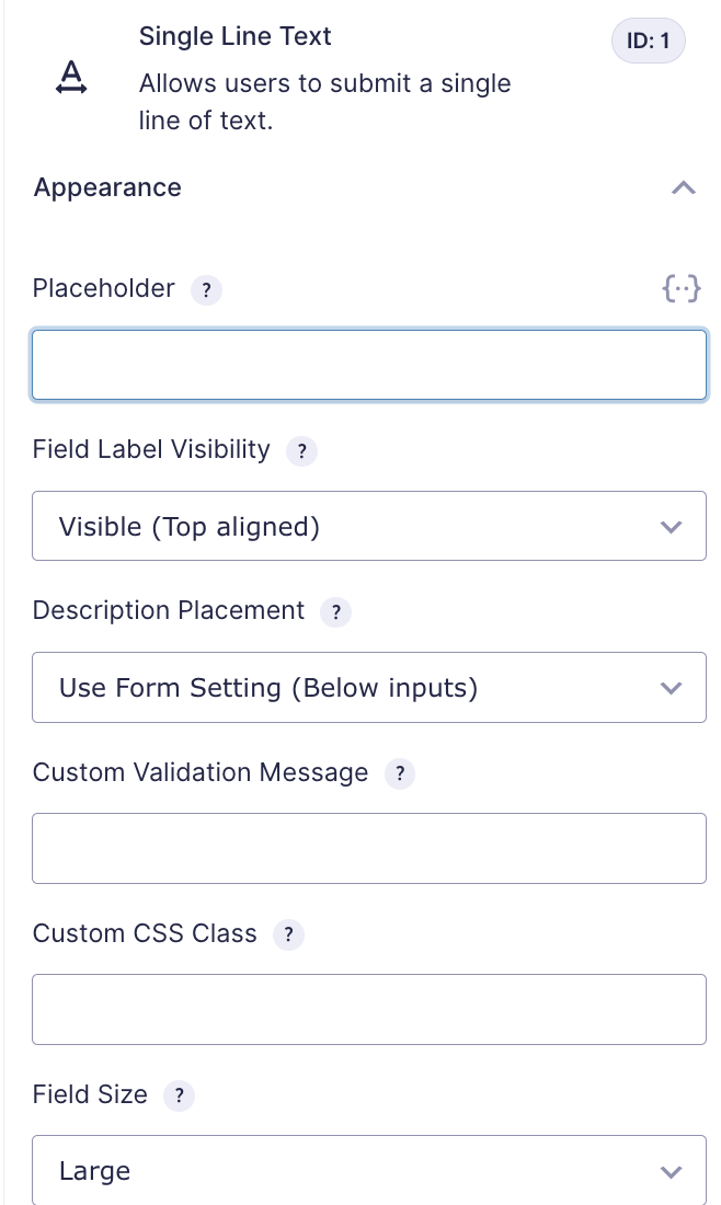
Appearance Settings Section
| Setting | Description |
|---|---|
| Placeholder | Text displayed inside the blank field to guide the user on what is expected. If the field is left empty upon submission, the placeholder is not saved with the entry. The field will appear blank in the Entries table. |
| Field Label Visibility | Select whether the field label is shown on the form. Label placement follows the setting specified in Form Settings. Note: Hiding the label may reduce accessibility. If you hide it, a warning appears. See this accessibility article for more details. |
| Description Placement | Determines where the field description appears in relation to the input field. |
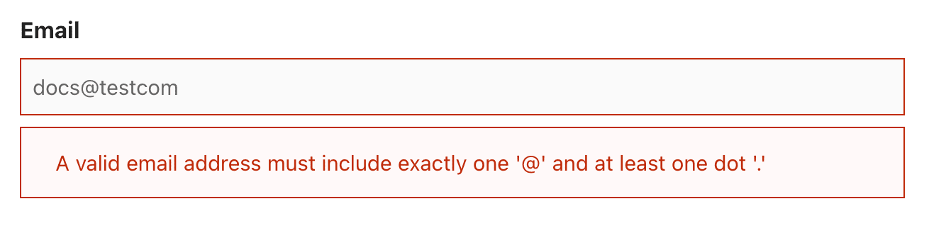
| Custom Validation Message | Define a custom error message that appears below the field in red when validation fails. All fields have a default error message; use this to override it. Example of a custom validation message. |
| Custom CSS Class | Add a custom CSS class to the field to apply specific styles and override default appearance. |
| Field Size | Choose between small, medium, or large. This controls the input area’s width for most fields, and the height for paragraph fields. Default is large. |
Advanced Settings Section
| Setting | Description |
|---|---|
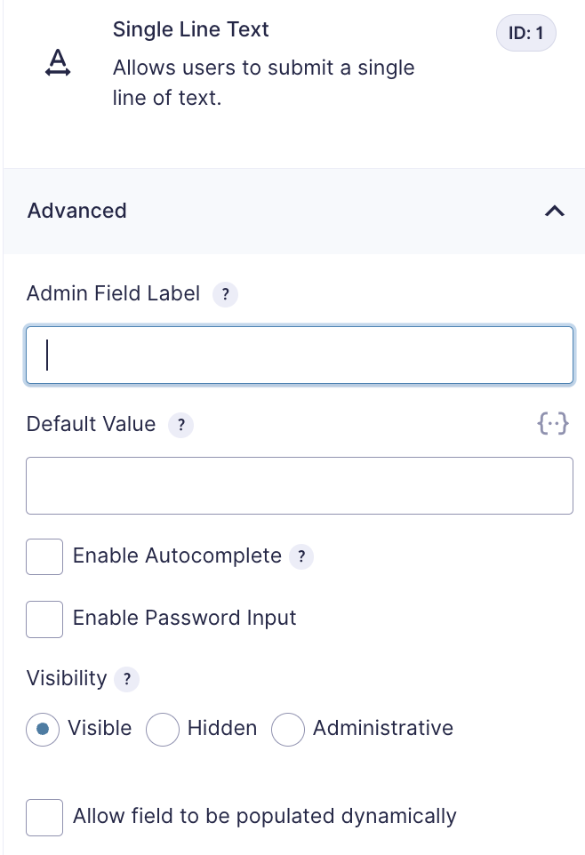
| Admin Field Label | The label that is displayed in administrative interfaces. It does not affect what is shown to users filling out the form. |
| Default Value | Pre-populates the field when the form is initially loaded. If unchanged during submission, it will be saved with the entry. Merge tags can be used here via the merge tag marker. |
| Enable Autocomplete | Select this setting to let browsers help a user fill in a field with autocomplete. You can enter a single autocomplete attribute or multiple attributes separated with a space. Only use valid attributes: invalid attributes will not be saved. Learn more about autocomplete in the accessibility documentation . |
| Enable Password Input | When enabled, text entered in this field will be obscured using the default “•” character for privacy and security. |
| Visibility | Controls how the field appears to the user: – Visible: Default; the field is shown normally. – Hidden: The field is hidden but still functions (useful for capturing hidden data or applying conditional logic). – Administrative: Not visible and adds no user-facing functionality, but still captures data for entries (e.g., from default values). |
| Allow field to be populated dynamically | Allow the field to be populated dynamically |
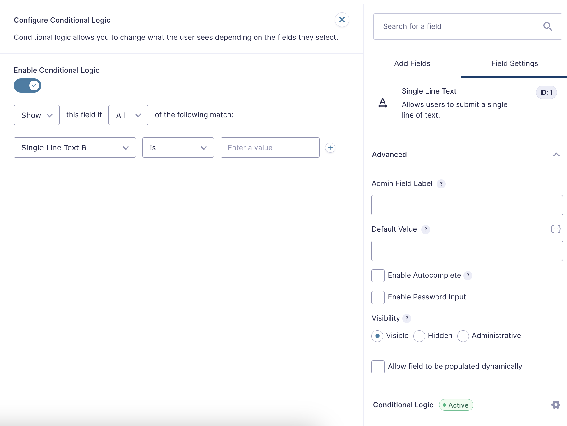
Conditional Logic Fly-out
Open the conditional logic fly-out and click the toggle Enable Conditional Logic to turn on conditional logic. The logic rules added here will control whether this field is shown or hidden. If disabled, this field will be shown by default. See this article for more information. This fly-out will only be available when fields that support conditional logic exist on the form.