The following article lists the settings associated with the operation and presentation of the Conversational Forms Add-On. Note that these are shown under the standard Form Settings area for whichever form you enable conversational mode. There are no add-on area global settings.
Enable Conversational Mode
Setting
Description
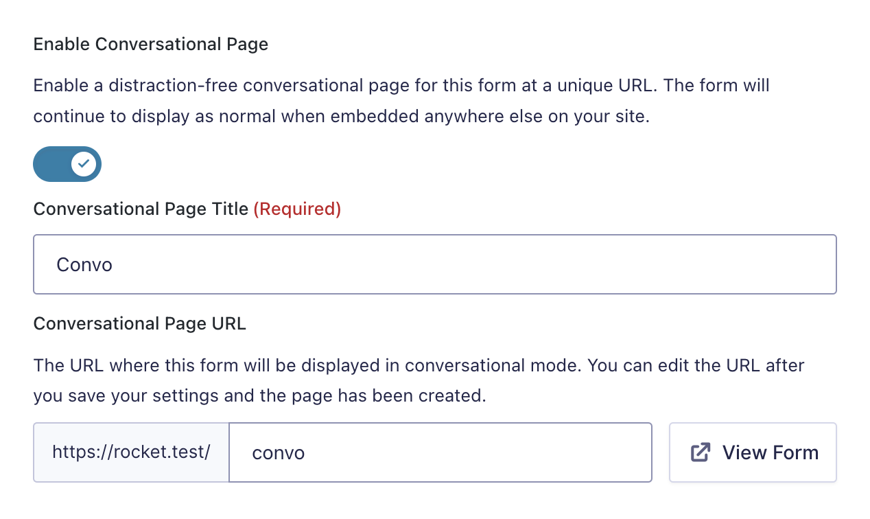
Enable Conversational Page
Enables conversational forms for the specific form. Once switched on, this will provide access to additional settings, as detailed in the rest of this article.
Conversational Page Title
Set the title for the page on which the conversational form will be rendered. Defaults to the form title.
Conversational Page URL
A unique permalink that users can visit to view and fill out your form. It defaults to a slugged version of the form title and is not editable until settings are first saved. If the URL is already in use on the site, then -form will be appended.
Form Design Settings
These settings can be used to tailor the look and feel of your conversational mode form.
Setting
Description
Layout
Set overall layout for dedicated form page.
Background Color
Set a background color.
Form Accent Color
Used for various form elements, such as buttons and progress bars.
Input Accent Color
Used for aspects of individual form inputs, such as checkmarks and dropdown choices.
Text Color
Set the text color for the form.
Enable Logo
Display a logo.
Logo
Set a logo image.
Logo Link
Set a link for the Logo to be directed to when it is clicked.
Enable Background Image
Display a background image.
Background Image
Set a background image.
Background Image Brightness
Set a link for the Logo to be directed to when clicked.
Welcome Screen Settings
To properly orient users to a conversational mode form, it can be good practice to use a “Welcome Screen”. This can avoid any disorientation that may happen when landing a user directly into the first question on your form. Use the welcome screen to introduce your form and provide any instructions or information needed to know before users proceed.
Setting
Description
Enable Welcome Screen
Secondary text is used as a message on the welcome screen.
Heading
Display a welcome screen before the user begins the conversation.
Description
Text on the button used for beginning the conversation.
Start Button Text
Text used as image alt attribute for the welcome image.
Image
Display an image on the welcome screen.
Image Alternate Text
Text used as image alt attribute for welcome image.
Buttons Settings
Setting
Description
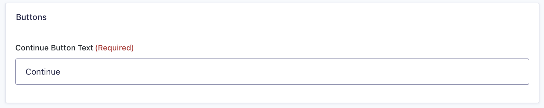
Continue Button Text
Text to be displayed on button used for progressing to next field.
Footer Settings
Customize the look and feel of your form navigation which appears below the form fields on all conversational mode pages.
Setting
Description
Footer Background Color
Set a background color for the navigation bar.
Enable Progress Bar
Display a progress bar.
Progression Type
Set a background color for the progress bar. By default, this color is based on your accent color.
Bar Background Color
Set a foreground color for the progress bar. By default, this color is based on your accent color.
Bar Foreground Color
Set a foreground color for the progress bar. By default this color is based off your accent color.