Summary
The Checkboxes field allows you to present one or many checkboxes which allow multiple selections. It is available under the Standard Fields section within the form editor.
Checkboxes field as displayed in the Field Library
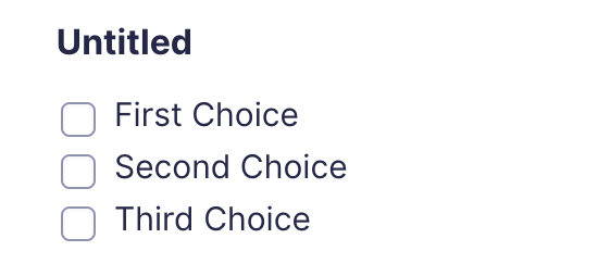
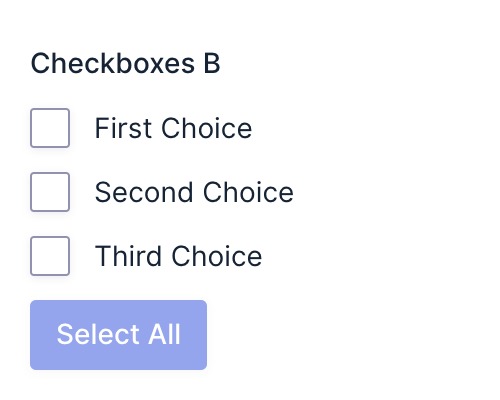
Checkboxes field as displayed in the Form Editor.

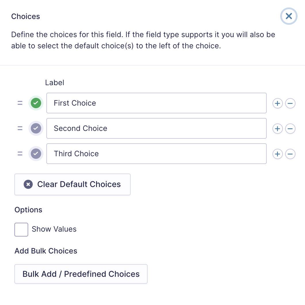
Click the Edit Choices button under Choices to open the Edit Choices flyout.
Note: When using a choice-based field type and your choice labels contain any HTML or special characters such as ampersands, commas, pipes, hyphens, or brackets of any type, you MUST enable the show values feature and give each choice a simple and unique value which does not contain any special characters. Failure to configure values could cause issues for features such as calculations, conditional logic, dynamic population, and validation. The value for each choice must be unique in any case, even if you’re not using HTML or special characters for the choice labels.
Common Settings
This field uses only common field settings for the Appearance and Advanced settings. For a description of each of the common field settings, refer to this article. Below you will find a description of specialty settings that are particular to this field.
General Settings
Click the Edit Choices button under Choices to open the Edit Choices flyout.
| Setting | Description |
|---|---|
| Choices | Add Choices to this field. You can mark each choice as checked by default by using the checkbox that appears to the left of each choice. Add a new choice by clicking the PLUS (+) icon and delete a choice by clicking the DELETE (-) icon. See note 1. |
| Clear default choices | Allows you to clear the choice set as default. Only available when a choice has been selected as the default choice. |
| Show Values | Checking this option will allow you to specify a value for each choice. Choice values are not displayed to the user viewing the form but are accessible to administrators when viewing the entry. |
| Bulk Add / Predefined Choices | Allows you to select a category and customize the predefined choices or paste your own list to bulk add choices. See this article for more information. |
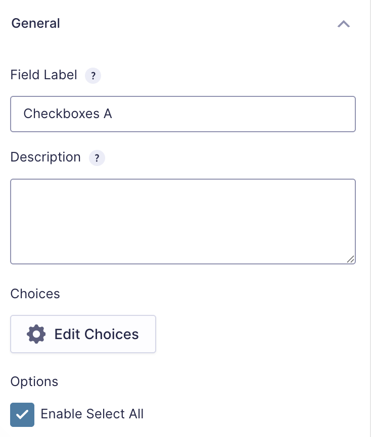
Enable Select All
Checking this adds a Select All button to the bottom of the checkboxes list, allowing the user to select all available list items.
Modifying Checkbox Choices After Form Submissions
After a form has collected entries, you should avoid changing checkbox choices. Modifying the choices, such as adding, removing, reordering, or renaming them, will change the input IDs associated with each option. This may break the link between stored entry data and the original choices, potentially preventing the data from being exported correctly.
Merge Tags
For more information on the use of merge tags, refer to these articles.
Usage
{Field Name:2.1:modifier}
Notes:
- The field name is optional.
- The second parameter is the field ID. If a single number, it can be used to get the value of the field ID. If multiple numbers separated by a period, it will get a specific selection within that field. For example, 2 will return the result of field ID 2, while 2.1 will return the first checkbox within field ID 2.
- The third, and any subsequent parameters are used for modifiers. These are separated by a colon, and may contain multiple modifiers if applicable.
Modifiers
| Modifier | Description |
|---|---|
| :value | Displays the actual value of the checkbox rather than the value label. |
| :currency | Displays the value as currency. |
| :price | Same as :currency. |
Calculations
If you’re going to use this field type in a calculation formula, please check Number Formatting Rules in the Calculations doc page.
Validation
The Checkboxes field validates that the submitted values correspond to choices configured in the field. Refer to the State Validation article for more information.