Summary
The Option field allows the creation of options for products created by a Product. Option fields have special functionality which displays how much selecting the option will add (or subtract) from the total. It is available under the Pricing Fields section within the form editor.
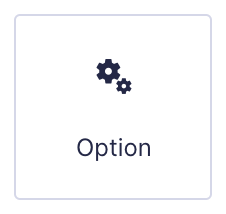
Option field as displayed in the Field Library
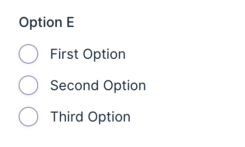
Option field as displayed in the Form Editor.
Common Settings
This field uses only common field settings for the Advanced settings. For a description of each of the common field settings, refer to this article. Below you will find description of specialty settings that are particular to this field.
General Settings
| Setting | Description |
|---|---|
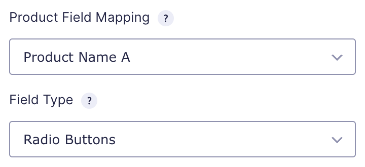
| Product Field Mapping | Select which product this field is tied to. This option is only available when there are two or more products. When only one product exists, Option and Quantity will automatically apply to that product. |
| Field Type | Select the type of field from the available form fields. See Field Types Options below. |
Choices
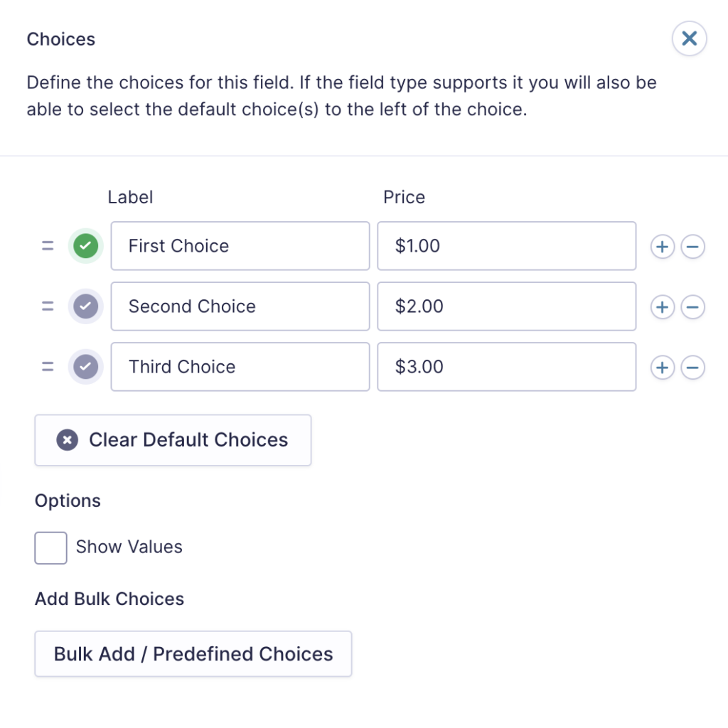
The Edit Choices button allows you to edit the Label, Value and Price for each choice.

Click the Edit Choices button under Choices to open the Edit Choices flyout.
| Setting | Description |
|---|---|
| Choices | Add Choices to this field. You can mark each choice as checked by default by using the checkbox that appears to the left of each choice. Add a new choice by clicking the PLUS (+) icon and delete a choice by clicking the DELETE (-) icon. |
| Show Values | Allows you to specify a value for each choice. Choice values are not displayed to the user viewing the form but are accessible to administrators when viewing the entry. |
| Clear default choices | Allows you to clear the choice set as default. Only available when a choice has been selected as the default choice. |
| Bulk Add / Predefined Choices | Allows you to select a category and customize the predefined choices or paste your own list to bulk add choices. See this article for more information on bulk loading choices. |
Option Field Type
This table lists the options available for displaying your quiz field to a user.
Note: When using a choice-based field type and your choice labels contain any HTML or special characters such as ampersands, commas, pipes, hyphens, or brackets of any type, you MUST enable the show values feature and give each choice a simple and unique value which does not contain any special characters. Failure to configure values could cause issues for features such as calculations, conditional logic, dynamic population, and validation. The value for each choice must be unique in any case, even if you’re not using HTML or special characters for the choice labels.
| Option | Method of Choosing |
|---|---|
| Checkboxes | Select one or multiple choices using checkboxes. ( Note ) Enable “Select All” creates a choice for the user to select all other choices. |
| Drop Down | Display choices in a dropdown box. Users can only select one. |
| Radio Buttons | Select one choice only by clicking a radio button. |
Modifying Checkbox Choices After Form Submissions
After a form has collected entries, you should avoid changing checkbox choices. Modifying the choices, such as adding, removing, reordering, or renaming them, will change the input IDs associated with each option. This may break the link between stored entry data and the original choices, potentially preventing the data from being exported correctly.
Appearance Settings
| Setting | Description |
|---|---|
| Enable enhanced user interface | By selecting this option, the Chose jQuery library will become active, allowing drop downs to be searched. |
Merge Tags
For more information on the use of merge tags, refer to these articles.
Usage
{Field Name:2}
Modifiers
This merge tag does not have any modifiers.