Summary
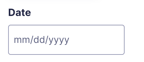
The Date field allows you to present a field that captures date data using the jQuery UI date picker. It is available under the Advanced Fields section within the form editor.

Date field as displayed in the Field Library

Date field as displayed in the Form Editor.
Common Settings
This field uses only common field settings for the Appearance and Advanced settings. For a description of each of the common field settings, refer to this article. Below you will find description of specialty settings that are particular to this field.
General Settings

| Setting | Description |
|---|---|
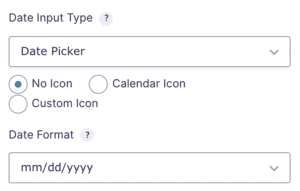
| Date Input Type | Date Picker will let users select a date from a calendar. Date Field will let users free type the date. Date Drop Down will let users select date from drop downs. |
| Icon | Allows you to set an icon which will be listed beside the date field. Options include: No Icon, Calendar Icon, Custom Icon |
| Date Format | Select the format you would like to use for the date input. Available options are listed below. |
Accepted Date Formats
- MM/DD/YYYY
- DD/MM/YYYY
- DD-MM-YYYY
- DD.MM.YYYY
- YYYY/MM/DD
- YYYY-MM-DD
- YYYY.MM.DD
Merge Tags
For more information on the use of merge tags, refer to these articles.
Usage
{Field Name:2:modifier}
Notes:
- The field name is optional.
- The second parameter defines the ID of the field that will be output in this tag.
- Within the third parameter, you can define an optional modifier to use. Only one modifier can be used per merge tag.
Modifiers
| Modifier | Description |
|---|---|
| :year | Outputs only the year used in the field. |
| :month | Outputs only the month used in the field. |
| :day | Outputs only the day used in the field. |
| :ymd | Outputs the date formatted as year/month/day. Example: 2016/10/31. |
| :dmy | Outputs the date formatted as day/month/year. Example: 31/10/2016. |
Validation
The Date field validates that the submitted value represents a real, correctly formatted date. Validation checks that the value can be parsed according to the field’s configured date format and that the resulting day, month, and year combination is a valid calendar date.
For example, a date such as February 30 would fail validation even if the format is correct.
When the Date Field or Date Dropdown input type is used, and the field is marked as required, validation also checks that all three inputs, month, day, and year, have been completed. When the Date Picker input type is used, the error message includes the expected date format to help the user correct their entry.