Summary
The Poll field is available when using the Polls add-on. This field will allow you to create polls to collect data from users. It is available under the Advanced Fields section within the form editor. Please note that you will need to have the Polls add-on installed and activated before this field type is made available.

Poll field as displayed in the Field Library
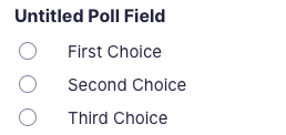
Poll field as displayed in the Form Editor.
Common Settings
This field uses only common field settings for the Appearance and Advanced settings. For a description of each of the common field settings, refer to this article. Below you will find description of specialty settings that are particular to this field.
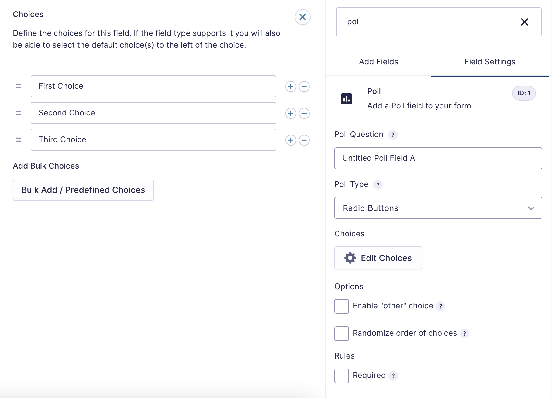

Click the Edit Choices button under Choices to open the Edit Choices flyout.
Poll Specific Settings
| Setting | Description |
|---|---|
| Description | Adds text that can be displayed with the poll question, and its appearance is controlled by the description placement option under the Appearance settings tab |
| Poll Question | Within this field, you will provide the question that you would like to ask the user. |
| Poll Field Type | Determines how the poll field will be displayed to the user. See Poll Field Type Options |
| Bulk Add / Predefined Choices | Clicking the Bulk Add / Predefined Choices allows you to select a category and customize the predefined choices or paste your own list to bulk add choices. See this article for more information. |
| Enable “other” choice | Check this option to add a text input as the final choice of your poll. This allows the user to specify a value that is not a predefined choice. |
| Randomize order of choices | Randomizes the choices when displayed to the user. |
Poll Field Type Options
This table lists the options available for displaying your poll field to a user.
Note: When using a choice-based field type and your choice labels contain any HTML or special characters such as ampersands, commas, pipes, hyphens, or brackets of any type, you MUST enable the show values feature and give each choice a simple and unique value which does not contain any special characters. Failure to configure values could cause issues for features such as calculations, conditional logic, dynamic population, and validation. The value for each choice must be unique in any case, even if you’re not using HTML or special characters for the choice labels.
| Option | Method of Choosing |
|---|---|
| Checkboxes | Select one or multiple choices using checkboxes. ( Note ) Enable “Select All” creates a choice for the user to select all other choices. |
| Drop Down | Display choices in a dropdown box. Users can only select one. |
| Radio Buttons | Select one choice only by clicking a radio button. |
Modifying Checkbox Choices After Form Submissions
After a form has collected entries, you should avoid changing checkbox choices. Modifying the choices, such as adding, removing, reordering, or renaming them, will change the input IDs associated with each option. This may break the link between stored entry data and the original choices, potentially preventing the data from being exported correctly.
Merge Tags
For more information on the use of merge tags, refer to these articles.
Usage
{Field Name:2}
Notes
- The first of these merge tag parameters is optional and is simply the field name for easier identification.
- The second parameter defines the field ID within the form. In the example above, it would be field ID 2.
- If accessing a specific option within the field, it can be accessed by separating the values with a period. For example, 2.3 would be the value of the 3rd choice from field ID 2.
Modifiers
This field does not have any modifiers.