Deprecation Notice: The Forms block functionality now exists in Gravity Forms core. The Gutenberg Block Add-On was provided during WP5 development stages, but is no longer actively developed. This add-on should be removed from your site installation.
Summary
The Gravity Forms Gutenberg Block is a content block for the new WordPress Block-based page editor that allows you to add any of your saved Gravity Forms as a content block from directly within the new WP5 editor.
The Gravity Forms Gutenberg Block is available to any user who has an active Gravity Forms license.
Caveat
With the WP5 Block-based editor (referred to as “Gutenberg” during development) released in Dec 2018, the Gravity Forms Gutenberg Block Add-On (Release Candidate) is an optional download for those who want to upgrade to WP5. As with all major updates to newly released software, proceed with caution.
Pre-Requisites
Usage
From within the editor, click any Add Block icon (+) and then select the Gravity Forms block, which can be found within the Embed section, or by using the block search feature.
Once added to the page, you can select which existing form you wish to embed using the drop down within the Gravity Forms block placeholder. Creation and editing of forms still takes place within standard Gravity Forms Form Editor.
Once a form is chosen, the block will display a representation of the form itself. (This preview can be disabled in the Advanced section of the block’s settings.) Note that the limited space of the editor pane means that form elements may be previewed in the editor using mobile layout resizing constraints, which may not be how they look when the form is viewed from within a desktop web browser, etc. Always preview your page first to see an accurate representation of the final form.
Block Options
 To edit the block options, select a form, and choose the appearance settings pane in the inspector (or click the horizontal ellipses to the right of the content block).
Form Title
Will toggle appearance of the form title on or off.
Form Description
Will toggle appearance of the form description on or off.
Conditional Logic
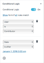 Allows setting of rules that define the conditions under which the form will show or hide at the moment the page is displayed. Rules can be based on user or date/time conditions.
Meeting the conditional logic tests can be set to show or hide the form.
User conditions can be based on the role, or the logged in/out status of the user.
Date/time conditions are relative to the time zone defined within your WordPress Settings.
Multiple rules can be specified, and the logic can be set to return a positive test as either when one of the specified rules matches (any), or when all of the rules (all) are satisfied.
Advanced > Preview
Toggles whether the full form is shown within the editor block, or just a marker for it.
Advanced > AJAX
Toggles embedding the form on the front-end using AJAX, allowing for confirmations and changing between form pages to happen without page reloads.
Advanced > Field Values
Specifies the default field values in an ampersand (&) separated list. For example, to set default values for fields with the parameters “dropdown” and “email” you would use [email protected]&dropdown=First Choice. If the block preview is also enabled in the Advanced tab of the block settings you will see the default values update in real time in the editor while editing the page or post.
For more detailed information on how to dynamically populate a field please see our documentation on dynamic population.
Advanced > Tabindex
Sets the tab index of the form element on the page.
Reusable Blocks

Any editor block, including the Gravity Forms block, can be set to be reusable using the option within the overflow menu icon. This creates a saved block that has all the options that were set at the time the reusable block was created. This saved block can be added to any page (look under the Saved section of the “block add” popover window).
To edit a reusable block, click the Edit button at the bottom of the block. Edits made affect all copies of that reusable block in use. To return a reusable block back into a regular block that can be edited independently, use the “Detach From Reusable Block” option.
