Introduction
What steps do I need to take to create an accessible form with Gravity Forms?
These questions can seem daunting when you are starting work on your project. The good news is that Gravity Forms is built to comply with WCAG 2.1 AA, the global standard for web accessibility. This article takes you through some settings and form fields to help educate you on what to use (and what to avoid) to move your particular form toward the best possible outcome for all users.
This is a checklist written to help you check your forms quickly and easily. For more information about the “why,” please read the accessibility documentation in the Knowledge Base.
Limitations
This checklist is an aid to help you make your form as accessible as possible, but it does not guarantee accessibility.
There are several external factors that can affect accessibility, and some areas of accessibility research differ in their views of exactly what is needed. But this article will help you lock down some of the most common settings and options that can affect accessibility. If you have strict compliance requirements, we recommend you bolster the knowledge provided in our documentation with the expertise of an accessibility consultant or advisor. That’s what we did!
Additionally, note that form elements from plugins are not included in this checklist, such as those added by the Gravity Forms payment add-ons.
This checklist was written for Gravity Forms 2.9, and we will look to periodically update it when there are accessibility improvements or changes in the forms.
Your WordPress Theme
First, a word about the WordPress theme you are using. The color contrast between the text and the background is important. Your visitors must be able to read the content in a form.
Gravity Forms ships with its own Default Form Theme Orbital that is made to be. The color contrast is optimized for a white background color, but your theme may have a darker background color that makes text unreadable when you use the Gravity Forms stylesheet. Check the color contrast ratio between the text and its background. Also check this for dark- and light mode of your WordPress theme It is recommended that the ratio be 4.5:1 or higher.
Depending on your theme, it may be possible to adjust or overrule some of the CSS using the customizer, or in the CSS of your theme. If needed, discuss options with your site developer or contact the theme provider for advice.
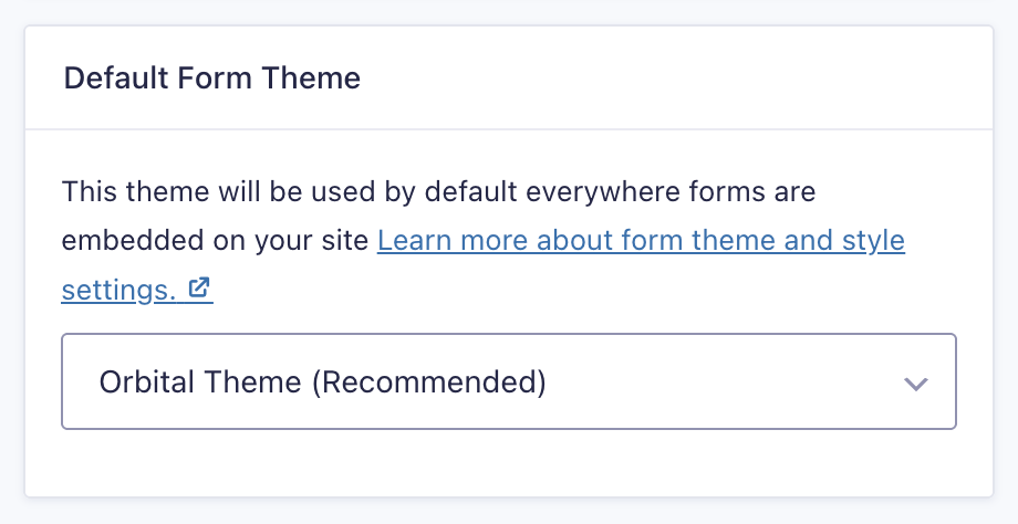
Gravity Forms Settings
Find the plugin setting with the Forms tab in the sidebar and choose “Settings”.
If you don’t use a fully custom form theme, select the Orbital Theme with the Default Form Theme option.
Form Settings
For a newly created form, go to the Form Settings tab and check the following settings that are important for accessibility:
- Label Placement: “Top aligned”
- Description Placement: “Above Inputs”.
- Validation Message Placement: “Above inputs”
- Sub-label Placement: “Above inputs”
- Validation Summary: “On”.
- Required Field Indicator: Ensure the option to show a required field indicator is selected.
Form Fields To Avoid
The following field types can create accessibility issues and are not recommended for use in an accessible form.
- Multiselect (reference)
- Datepicker: use Date Field or Date Drop Down instead. (reference)
- HTML blocks with text that contain essential information.
- Section breaks with text that contains essential information.
- reCAPTCHA V2: for an accessible alternative, use the honeypot action, as found in the form settings.
Field Settings
The form fields settings can be found in the right hand sidebar when you create or edit a form. If a setting is not mentioned here, it has no known accessibility issues.
General
- Field Label: always complete the Field label and explain clearly to the user what needs to be filled out.
- Input mask: do not use an input mask. Leave that box unchecked.
Appearance
- Field Label Visibility: Always use a visible label, and never hide it.
- Sub-Label Placement: above input.
- Custom Validation message: write meaningful to-the-point custom error messages.
- Enhanced User Interface: do not enable the enhanced User Interface for dropdowns.
- Choice Label Visibility: Always show the choice label for Image Choice fields.
Advanced
- Rich text Editor: Do not enable the Rich text editor.
- Autocomplete: Enable autocomplete for the input, fields. The default fields for name, address, and fields have the autocomplete values already filled out.
Adding a form to a page
Don’t add more than one of the same form to a web page. Each form on the page must be unique. Add a form block to the page, then select its settings.
Form Settings
Enable “Show Form Title”. “Show Form Description” is optional.
Form Styles
The default theme Orbital is optimized for accessibility. In case your website uses a custom-built WordPress theme for Gravity Forms, ask the development team if that meets the accessibility requirements.
Colors
If you change the colors, make sure the color contrast of
- The text against its background is at least 4.5:1.
- The border-to-background ratio is at least 3:1.
Advanced
Do not set a positive tabindex. Keep the tabindex value -1. This means that no tabindex will be set.