

Summary
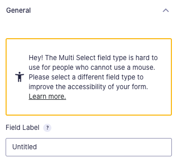
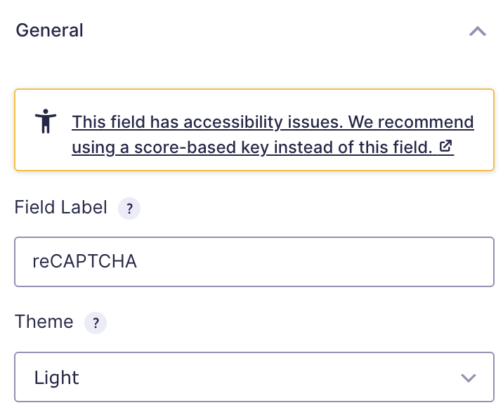
This article provides information regarding accessibility warning messages you may receive for a particular field on your form. The message is presented in the Field Settings pane of the Form Editor. See screenshots at the bottom for some examples.
Description
To ensure your form can be completed by all your visitors, limit it to fields that work for everyone. People who use assistive technology may find some form fields hard to navigate. Some fields are hard to understand when used with screen readers or voice recognition software.
If your forms must comply with accessibility guidelines like WCAG, section 508 or the ADA, then please be aware that some form fields with accessibility issues can’t be used. From Gravity Forms 2.5 onwards we present a warning message for the most common of those, and have listed some alternatives here.
Advice Regarding Form Layout
Label Placement
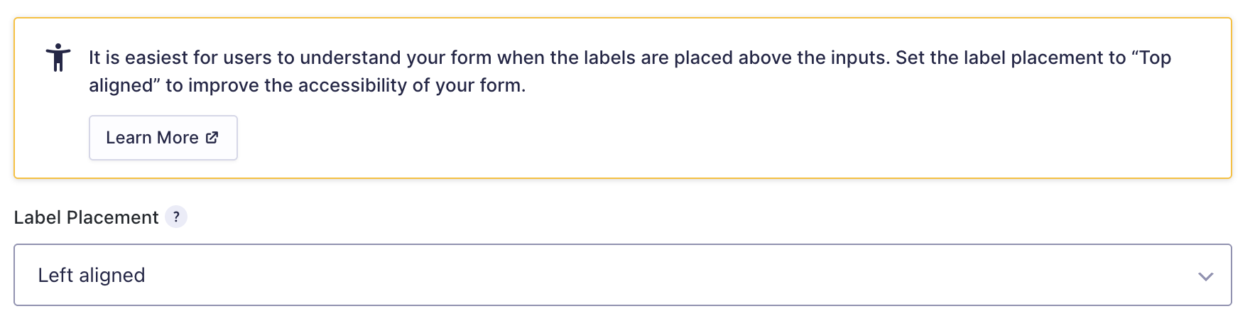
A warning will be displayed in the Form Settings when Label Placement is not set to Top Aligned
Validation Message Placement
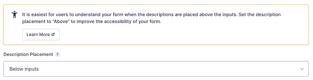
A warning will be displayed in the Form Settings when Description Placement is set to Below Inputs.
Validation Message Placement
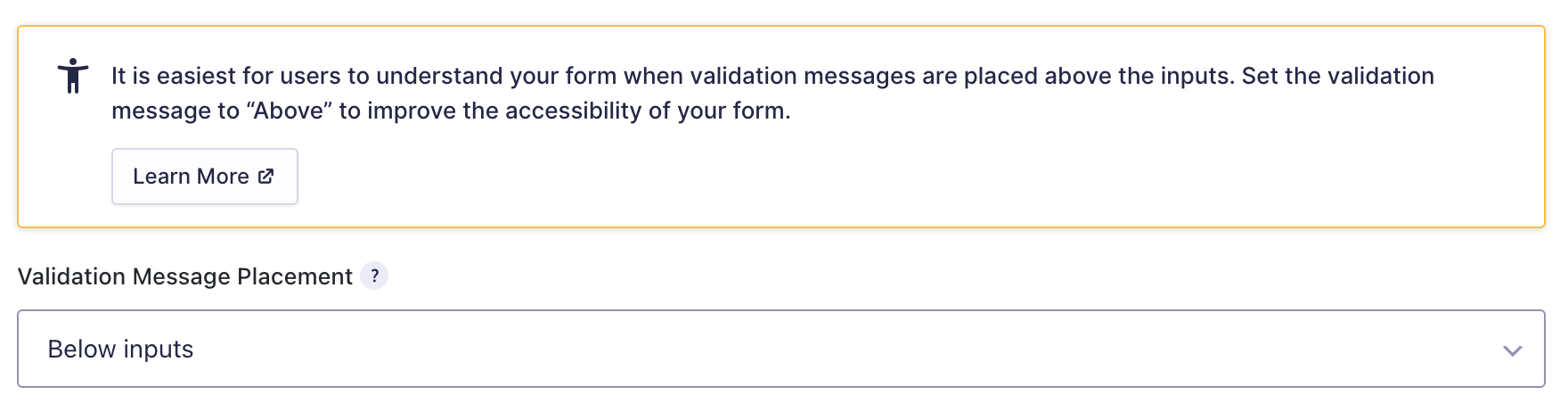
A warning will be displayed in the Form Settings when Validation Message Placement is set to Below Inputs.
Sub-Label Placement
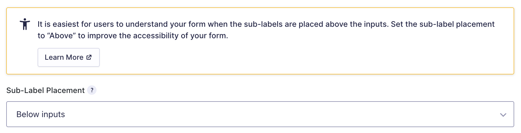
A warning will be displayed in the Form Settings when Sub-Label Placement is set to Below Inputs.
Advice Regarding Specific Fields
Enhanced User Interface
The Enhanced User Interface is not accessible for screen reader users and people who cannot use a mouse because the field is removed from the tab order on the page.
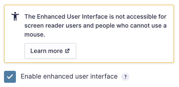
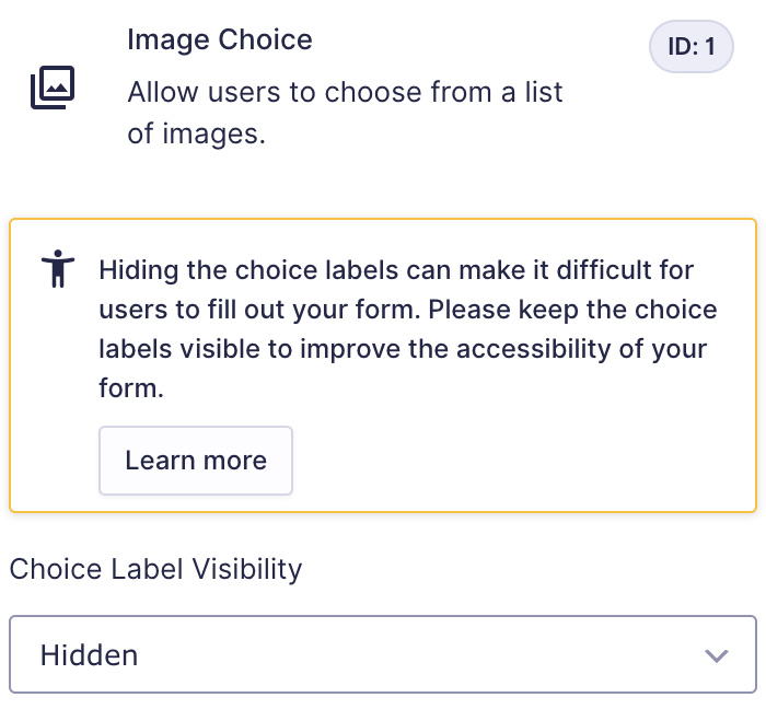
Image Choice
A warning will be displayed in the Form Editor when Choice Label Visibility is marked as hidden.
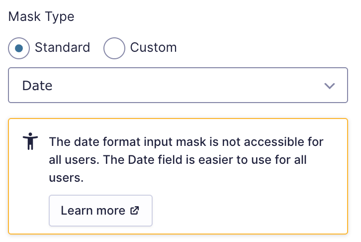
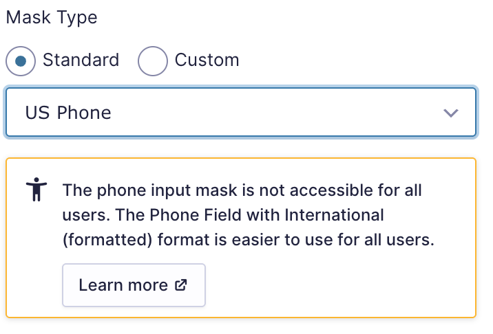
Input Mask
Multiselect
The Multiselect field is difficult for people using assistive technology such as screen readers or voice recognition software, as they cannot properly select multiple options. The better choice is using checkboxes.
A warning will be displayed in the Form Editor when Field Label Visibility is marked as hidden.
reCAPTCHA Checkbox
The reCAPTCHA Checkbox field is difficult for people using assistive technology. The Google Support website has a page dedicated to the accessibility of reCAPTCHA V3 via an audio challenge. This can present other challenges for your visitors, though. Refer to this article for more information.
Google reCAPTCHA V2
The Google Support website has a page dedicated to the accessibility of reCAPTCHA V2 via an audio challenge. This can present other challenges for your visitors, though.
Firstly, this is not an option for deafblind users. Secondly, reCAPTCHA only offers an English audio challenge and expects an English answer, which makes it harder for non-native English speakers to understand the challenge or increases the likelihood of incorrect answers.
There is also a cognitive and cultural accessibility issue. Not everyone understands the visual challenges.
If you have a form that is vital for your visitor to fill out, don’t put the burden of proving they are human on them.
Note: Gravity Forms introduced a reCAPTCHA Add-On in June 2021 that supported reCAPTCHA v3. With the reCAPTCHA Add-On, there is no need to add a CAPTCHA field to your form. The Google reCAPTCHA scripts are output on every page of your website. You can read more about our reCAPTCHA Add-On here.
Submit Button
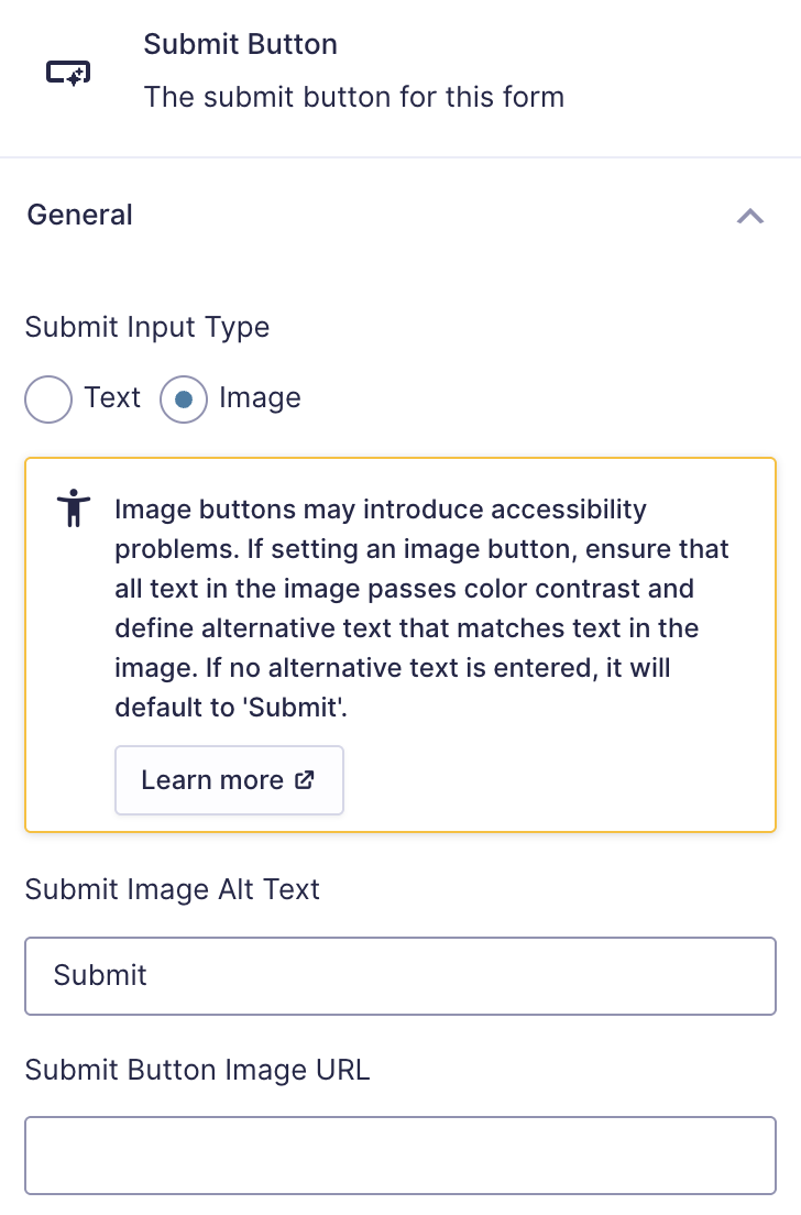
Image buttons may introduce accessibility problems. If setting an image button, ensure that all text in the image passes color contrast and define alternative text that matches the text in the image. If no alternative text is entered, it will default to ‘Submit’.

Adding conditional logic to the form submit button could cause usability problems for some users and negatively impact the accessibility of your form
Introduced In Gravity Forms 2.5
These warning messages were added in Gravity Forms 2.5. The warning messages contain a link to this article.
Further Information
Refer to the Accessibility area of our documentation site for more helpful advice on improving your form’s accessibility.
Remove The Warning
Since the warning suggests that the field or its features could affect functionality or accessibility, you can resolve it by taking specific actions:
Use a Different Field.
Replace the problematic field with a more suitable alternative. For example, use a Drop Down field or Multiple Choice field instead of a Multi Select field for better accessibility.
Simplify Field Features.
Disable or avoid advanced features that may trigger the warning, such as input masks or complex configurations.
Review Best Practices.
For guidance on designing forms that align with best practices for functionality and accessibility, refer to our Accessibility Checklist for Gravity Forms article.