Introduction
With Gravity Forms you have a great tool to create accessible web forms. In this documentation we want to help you:
- Set up a form with accessibility in mind.
- What to look out for to safeguard the accessibility of your forms.
Note: To help you make your forms work for as many people as possible, we give you guidelines and best practices on this page. Please read our Accessibility Checklist for Gravity Forms.
Why should you make your form accessible? And what is Web Accessibility?
With form accessibility we mean that a form is usable by as many people as possible, on as many different devices as possible.
Like:
- A web developer who uses a computer, keyboard and a mouse.
- A blind woman who uses a computer, keyboard and a screen reader.
- A blind and deaf user, who uses a computer, keyboard, a screen reader and a braille display.
- A traveler who uses a smartphone in the train with slow WiFi.
- An elderly person, who uses an iPad in bright sunlight.
- A child that broke her arm and uses only the keyboard.
You can come up with a lot of ways to use the internet. The W3C listed a few stories of web users.
As for disabled people: the estimate is that approximately 20% of all people have some sort of disability. That’s 20% of your form users. And as the population is growing older, this number will increase.
We are all different and situations differ too. It’s not only disabled people that use the web differently than you may expect. If you make your forms accessible, all users will benefit.
To help you make your forms work for as many people as possible, we give you guidelines and best practices on this page.
If you are a theme or plugin developer, please also check the Developers Documentation on Form Accessibility.
About Guidelines and Legal Implications
For Gravity Forms we follow the global guidelines for web accessibility: the Web Content Accessibility Guidelines, version 2.1, level AA (WCAG 2.1 AA). Some countries have WCAG 2.0 AA as legal requirement or have a special set of guidelines. If you want to know which guidelines and legal regulations apply for your country and for your type of website, please consult with your government. The W3C maintains a list of regulations per country: Web Accessibility Laws & Policies. But please also check with your own government, as this list is not always up-to-date.
Settings for Optimal Accessibility
Form Settings
After creating a new form, go to the Settings, Form Settings and set:
Adding Form Block to a Page
When you add the block for a form to a page, under the Block Settings set:
- Form settings: Enable the Form Title.
- Advanced settings: Do not set a positive tabindex. Keep the tabindex value -1. This means that no tabindex will be set.
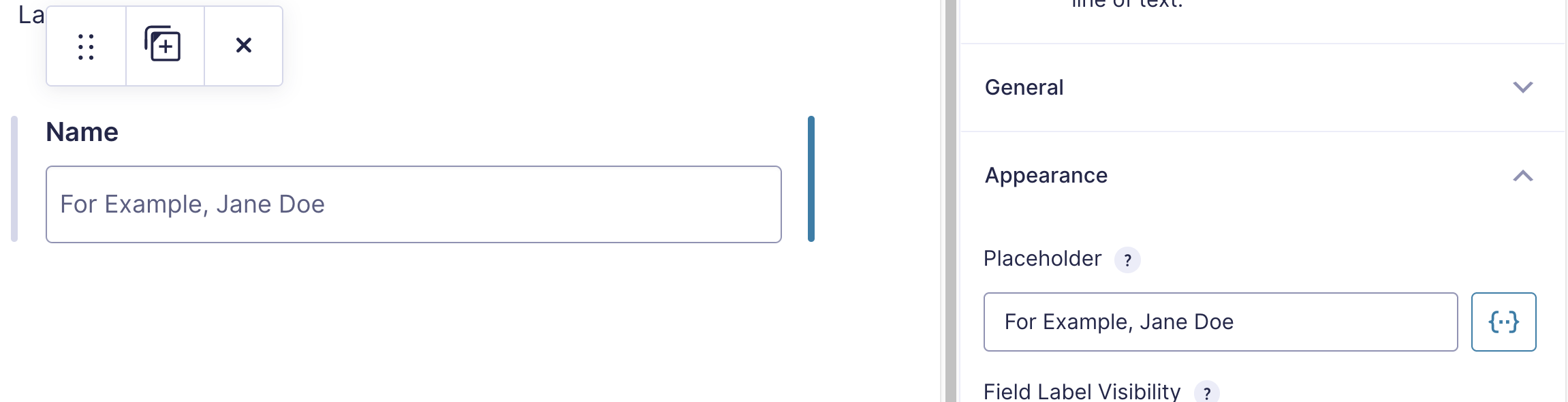
Labels, Placeholders and Descriptions
- A label tells the user what they need to fill out and must always be visible.
- Place the label above the input.
- Keep a label about the input fields only, don’t put links, tooltips or other HTML inside them.
- The placeholder is used for a suggestion on how to fill out an input field.
- The description can be used to give extra information about the input field.
- The label should always be meaningful and visible. The placeholder and description are optional.
Why?
- When the label is always visible, people don’t forget what they have to fill out.
- When the form inputs are filled with autocomplete, the users can better check if the input is added to the right input field when the label stays visible.
- People read from the top down. Placing a label below the input may cause confusion about which label belongs to which input.
- When a user starts typing the placeholder disappears, so if the placeholder is used as the only label, the user can get confused on what to fill out.
- If you use links inside a label, assistive technology, like a screen reader user may get confused about what to fill out, keep the label text to the point. Use the description to add extra information.
- Gravity Forms makes sure that the description is also read out for people with a screen reader. Use that field to give extra information.
Examples
Label: Name
Placeholder: For example Jane Doe
Submit button
The field settings for a button:
- Submit Button > General > Submit Input Type: Choose “Text”.
- Submit Button > General > Submit Button Text: Use descriptive text (see “About Naming”).
- Submit Button > Conditional Logic: Do not enable conditional logic.
Tabindex
Avoid using a positive tabindex on form controls.
Some users can’t use a mouse, for example because they are blind or don’t have fine motor skills. Then they can use the keyboard to navigate a website. If you use the tab key you can jump from focusable element to focusable element (like a link, button or a form element).
If you add a positive tabindex to a form element, that element will be the first that gets focus on a page. In fact you are hijacking the natural focus order. That can be very annoying for someone who is navigating the site with a keyboard and just wants to access the main menu and not subscribe to your newsletter.
Give the user control and don’t decide for them.
Use of Color
Usually the colors of your forms are determined by the WordPress theme you are using. If you want to change the colors in the customizer, please keep a few things in mind:
- The color contrast between text and its background and borders and their background must be sufficient. This is explained in the Accessibility Documentation for Developers.
- Don’t refer to or give meaning to color. Like: “Press the green button to continue”.
Not everybody has perfect eyesight. By giving text and borders a good color contrast against its background, you are assured most people can find and read it, even with an iPad in the sun.
8% Of all men and 0.4% of all women are color blind. They could miss the reference to the color.
HTML Blocks and Section Breaks
Make sure an HTML block or Section Break doesn’t contain content that is essential for filling out the form. Assistive technology, like a screen reader may miss this content as it’s not announced when they fill out a form.
Use the description field with an input to add essential information. As the description field will be read out for blind users by their screen readers.
About Naming
Make links, labels and buttons easy to understand on their own. Don’t let your users guess, or have to read all around a link or button to see what’s happening. Use descriptions if more information is needed to fill out an input.
For example:
- Give a button a clear text. “Submit” is very generic. What about “Subscribe”?
- Give a link a describing text. “Click here” is not really useful. What about “our privacy statement” as link text? Write your sentences so that the link text stands out on its own, without forcing the user to read around the text to know why they should click here.
- Give a clear description with a new password, like: Please enter a password of more than 8 characters long.
Give Users an Idea About What to Expect
Do you have a form with multiple steps? That’s a good idea to break a long form into manageable pieces for the user. But don’t keep users in the dark about how many steps it takes to fill out a form.
If you use page breaks, also set a visible progress bar.
People with an anxiety disorder (and actually, everyone else too) will feel much more comfortable if they know what to expect. Inform users on the amount of steps. Give them a way to return to previous steps to double check if everything is filled out properly.
Give buttons and links a descriptive text so it’s clear what to expect when a user clicks a button or link.
reCAPTCHAs
Accessibility best practice: CAPTCHAs and reCAPTCHAs can be very challenging to fill out for people who are blind or have a cognitive disability or aren’t that web savvy.
Please consider if you really need them. You may need to find another way to prevent spam. Enabling the Anti-spam honeypot can be an option for your site or use a spam protector plugin.
Google’s reCaptchas V3 may be an option, but also can violate the privacy of your users. It’s complicated.
First of all: don’t put the burden of preventing spam on your users, you may block real users from filling out your form.
Form Validation
What is Required?
Not all users know what the asterisk () means. So if you indicate a required field with an asterisk (), put a line above the form with an explanation or add (required) within the label.
Custom Validation Messages
Use the Custom Validation Messages with the form inputs to provide meaningful error messages. A text like “This field is required” can be improved on, for example use “Please enter your full name”.
Give the user all the help you can offer to fill out a form, including your contact information if you really want the user to be able to fill out the form.